


In the previous post, I introduced the Reusable Chart API and its multiple benefits when compared to the standard example-based approach of building D3 charts. This time, I will go into deeper detail about how you can further advance your workflow. By using Test-Driven Development when building your D3 charts, you will be able to embrace change, mercilessly refactor your code and at the same time, get executable documentation for your components.

I’ll walk you through the creation of a simple bar chart using Test-Driven Development (TDD). But first, let’s compare this with a common approach to writing d3 code.
The Standard Way
To illustrate the standard way of building charts, we are going to use the simplest example out there, the Bar Chart example by Mike Bostock. Let’s walk over it quickly:
Creating the container
// Setting up chart dimensions
var margin = {top: 20, right: 20, bottom: 30, left: 40},
    width = 960 - margin.left - margin.right,
    height = 500 - margin.top - margin.bottom;

// Setting values and Margin Convention
var svg = d3.select("body").append("svg")
    .attr("width", width + margin.left + margin.right)
    .attr("height", height + margin.top + margin.bottom)
  .append("g")
    .attr("transform", "translate(" + margin.left + "," + margin.top + ")");
Here we are creating the container and for that we are using the Margin Convention to manage the positioning of the chart. This is a pretty cool trick that helps you avoid some headaches when moving your elements around.
Setting up scales and axes
We will set up part of the scales and the axis. (We will need the real data in order to set its domains):
// Scale functions
var x = d3.scale.ordinal()
    .rangeRoundBands([0, width], .1);

var y = d3.scale.linear()
    .range([height, 0]);

// Axis functions
var xAxis = d3.svg.axis()
    .scale(x)
    .orient("bottom");

var yAxis = d3.svg.axis()
    .scale(y)
    .orient("left")
    .ticks(10, "%");
Loading data
Here, we are fetching the data using one of the >D3 Request helpers and applying a cleaning function that coerces the value to a number:
// Data loading
d3.tsv("data.tsv", type, function(error, data) {
  if (error) throw error;
  // Code here
});

// Cleaning function
function type(d) {
  d.frequency = +d.frequency;
  return d;
}
Drawing axes
Once we complete the scales, we can draw both axes by appending ‘g’ elements and the text (for the Y axis):
  // Rest of the scales
  x.domain(data.map(function(d) { return d.letter; }));
  y.domain([0, d3.max(data, function(d) { return d.frequency; })]);

  // Draws X axis
  svg.append("g")
      .attr("class", "x axis")
      .attr("transform", "translate(0," + height + ")")
      .call(xAxis);

  // Draws Y axis
  svg.append("g")
      .attr("class", "y axis")
      .call(yAxis)
    .append("text")
      .attr("transform", "rotate(-90)")
      .attr("y", 6)
      .attr("dy", ".71em")
      .style("text-anchor", "end")
      .text("Frequency");
Drawing bars
This is the main point of the chart, made with SVG “rect” elements:
    // Draws bars
    svg.selectAll(".bar")
      .data(data)
    .enter().append("rect")
      .attr("class", "bar")
      .attr("x", function(d) { return x(d.letter); })
      .attr("width", x.rangeBand())
      .attr("y", function(d) { return y(d.frequency); })
      .attr("height", function(d) { return height - y(d.frequency); });
In the previous code we can see the enter/update/exit pattern. As you probably know, we are repeating all the instructions that comes after enter() for each data entry on our data array.
Results
So now we have a bar chart that works, right? Well… it’s true, it works, and probably you could copy this code, modify it a bit and use it somewhere on your website. But let’s be serious, who thinks this is good-quality code?
Drawbacks
I’d like to point out some of the main problems of the above example:
- It’s a monolithic function that you need to read from top to bottom to know what it is doing.
- There is a lot of code chaining, creating compact code that is not really flexible.
- It’s hard to change things. Basically, you would need to change hard-coded values.
- Impossible to reuse (Copy and paste don’t count!).
- It’s very delicate: we won’t know if it works once we modify any line of code.
The Test-Driven way
In the next part of this post, I will show you how this same bar chart example would look with a Test-Driven approach. I am going to build the chart tests by test using Jasmine, but you could use any other test framework.
The before block
// Inside the beforeEach block:
container = d3.select('.test-container');
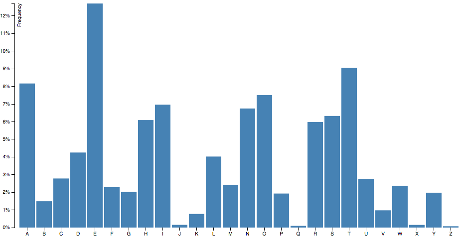
dataset = [
{ letter: 'A',
frequency: .08167
},{
letter: 'B',
frequency: .01492
},...
];
barChart = barChart();
container.datum(dataset).call(barChart);
This is the code that is going to kick off our tests, and as you have surely noticed, it looks a lot like the use example in my previous post. We need three things: a container, a set of data and our bar chart. The last line mixes them together.
Test for a basic chart
// Testing basic chart
it('should render a chart with minimal requirements', function(){
    expect(containerFixture.select('.bar-chart').empty()).toBeFalsy();
});
The first and more basic test we can write checks for the existence of a DOM element with the class “bar-chart”. To do this, we have several options, and my preferred is using .empty(), that returns true if the selection is empty. We could also do it by getting the first node with .node() or the size of the selection with .size(), as we will see later.
Basic chart code
// Reusable Chart API pattern
return function module(){
    var margin = {top: 20, right: 20, bottom: 30, left: 40},
        width = 960, height = 500,
        svg;

    function exports(_selection){
        _selection.each(function(_data){
            var chartWidth = width - margin.left - margin.right,
                chartHeight = height - margin.top - margin.bottom;

            buildSVG(this);
        });
    };
    return exports;
}
with buildSVG being:
/**
 * @param  {HTMLElement} container DOM element that will work as the container of the graph
 * @private
 */
function buildSVG(container){
    if (!svg) {
        svg = d3.select(container)
            .append('svg')
            .classed('bar-chart', true);
    }
    svg.attr({
        width: chartWidth + margin.left + margin.right,
        height: chartHeight + margin.top + margin.bottom
    });
}
In the above code, we build our component’s core by using the Reusable Chart API that I wrote about in the first part of this series. The resulting function will accept a D3 selector that will act as the container and a set of data attached to that selection.
Inside the buildSVG function, we’ll check if the SVG element is there, and create it if it doesn’t exists. We will always update the size of the container to match the size and margins set in our private variables.
Test for containers
// Container creation test
it('should render container, axis and chart groups', function(){
    expect(containerFixture.select('g.container-group').empty()).toBeFalsy();
    expect(containerFixture.select('g.chart-group').empty()).toBeFalsy();
    expect(containerFixture.select('g.x-axis-group').empty()).toBeFalsy();
    expect(containerFixture.select('g.y-axis-group').empty()).toBeFalsy();
});
I really like to have my markup ordered in proper containers, and this is especially true when working with SVG. The main advantage is that to move things around, we just need to change the X- and Y-attributes of the group that contains your elements.
Code for containers
/**
 * Builds containers for the chart, the axis and a wrapper for all of them
 * Also applies the Margin convention
 * @private
 */
function buildContainerGroups(){
    var container = svg.append("g").attr("class", "container-group");

    container.append("g").attr("class", "chart-group");
    container.append("g").attr("class", "x-axis-group axis");
    container.append("g").attr("class", "y-axis-group axis");
}
The code is pretty straightforward, as it is just appending ‘g’ elements with the proper classes to the DOM.
Test for the axis
// Axis drawing test
it('should render an X and Y axis', function(){
    expect(containerFixture.select('.x.axis').empty()).toBeFalsy();
    expect(containerFixture.select('.y.axis').empty()).toBeFalsy();
});
We want our test to have axes and scales, but here we are just testing for the axis on the DOM, so why is this the case? We do it because we want to know that our chart works by checking the public effects of it, not the internals of the chart. In this case, those public effects are only reflected on the DOM. We won’t try to check if there is a set of scale or axes functions being defined, as those are implementation details.
Code for the scales
/**
 * Creates the x and y scales of the graph
 * @private
 */
function buildScales(){
    xScale = d3.scale.ordinal()
        .domain(data.map(getLetter))
        .rangeRoundBands([0, chartWidth], 0.1);

    yScale = d3.scale.linear()
        .domain([0, d3.max(data, getFrequency)])
        .range([chartHeight, 0]);
}
Note that in buildScales(), I am using the accessor functions ‘getLetter’ and ‘getFrequency’. This are just aliases for function(d) { return d.letter } and function(d) { return d.frequency; }. I like the readability of it, even if we lose some flexibility when debugging.
Code for the axis
/**
 * Creates the d3 x and y axis, setting orientations
 * @private
 */
function buildAxis(){
    xAxis = d3.svg.axis()
        .scale(xScale)
        .orient('bottom');

    yAxis = d3.svg.axis()
        .scale(yScale)
        .orient('left')
        .ticks(10, '%');
}
The code on buildAxis() is almost the same as in the standard code.
Code for the axis drawing
/**
 * Draws the x and y axis on the svg object within their
 * respective groups
 * @private
 */
function drawAxis(){
    svg.select('.x-axis-group')
        .append('g')
        .attr('class', 'x axis')
        .attr('transform', 'translate(0,' + chartHeight + ')')
        .call(xAxis);

    svg.select('.y-axis-group')
        .append('g')
        .attr('class', 'y axis')
        .call(yAxis)
      .append('text')
        .attr('transform', 'rotate(-90)')
        .attr('y', 6)
        .attr('dy', '.71em')
        .style('text-anchor', 'end')
        .text('Frequency');
}
With this last piece of code, we will finally make the test pass, as we finally draw the axis elements into the DOM.
Test for bar drawing
// Bar drawing test
it('should render a bar for each data entry', function(){
    var numBars = dataset.length;

    expect(containerFixture.selectAll('.bar').size()).toEqual(numBars);
});
The test for the actual bars is super simple. We select all bars and count them, verifying that there is one for each data entry.
Code for bar drawing
/**
 * Draws the bar elements within the chart group
 * @private
 */
function drawBars(){
    var gapSize = xScale.rangeBand() / 100 * gap,
        barW = xScale.rangeBand() - gapSize,
        bars = svg.select('.chart-group').selectAll('.bar').data(data);

    // Enter
    bars.enter()
        .append('rect')
        .classed('bar', true)
        .attr({
            width: barW,
            x: chartWidth, // Initially drawing the bars at the end of Y axis
            y: function(d) { return yScale(d.frequency); },
            height: function(d) { return chartHeight - yScale(d.frequency); }
        });

    // Update
    bars.transition()
        .ease(ease)
        .attr({
            width: barW,
            x: function(d) { return xScale(d.letter) + gapSize/2; },
            y: function(d) { return yScale(d.frequency); },
            height: function(d) { return chartHeight - yScale(d.frequency); }
        });
}
And here we have the Enter/Update/Exit pattern! In this case, we are going do something a bit fancier. We’re going create the bars at the end of the graph (Enter block) and then transition them to their right positions (Update block). That way we will see a nice animation when loading the chart.
API accesor test
// API accessor test
it('should provide margin getter and setter', function(){
    var defaultMargin = barChart.margin(),
        testMargin = {top: 4, right: 4, bottom: 4, left: 4},
        newMargin;

    barChart.margin(testMargin);
    newMargin = barChart.margin();

    expect(defaultMargin).not.toBe(testMargin);
    expect(newMargin).toBe(testMargin);
});
So now we have the same bar chart. Actually, is it the same? No! Now we can configure it easily by creating getters and setters. Here you can see the test for our margin setter.
API accessor code
/**
 * Gets or Sets the margin of the chart
 * @param  {object} _x Margin object to get/set
 * @return { margin | module} Current margin or Bar Chart module to chain calls
 * @public
 */
exports.margin = function(_x) {
    if (!arguments.length) {
        return margin;
    }
    margin = _x;
    return this;
};
And this is how we usually create getters and setters for the Reusable Chart API. We check if we are passing an argument to the margin function, and if that’s true, we set the margin value to it. If not, we simply return the current margin value. The major gain of this method is that we could eventually use it to configure a cleaning function, a callback or any variable that changes the values of other private variables.
Now we are done! Please take a look at the finished code:
Which code would you prefer to work with?
Benefits
Safe refactor
Once you have your fully tested chart, what stops you from refactoring it and trying new things? Nothing! You have your back covered, as you will know when your chart is working and when it is not. Tests will also help you code iteratively. You can try a first approach that is not super elegant, but once it’s working and your test are in place, you can be more adventurous and find the best option without any stress.
You will learn more
Sometimes we developers don’t have a lot of time to code. We just look for something on the Internet or Stackoverflow, paste it and if it works, leave it like that. We are all guilty of that. This won’t happen with a TDD approach because it forces you to understand what you are actually doing.
You will learn more about the D3 API, as every time you need to check something, you will need to know about the methods you are using. Also, you will be more goal-oriented because tests first forces you to think about what you are doing before typing any lines of code.
Helps you communicate
Using TDD, you will be creating the documentation as you go, and these docs won’t get outdated! This means that your code itself will communicate what it is accomplishing. Testing also makes your code small and specific, so it’s easier for the next developer to catch up.
Quality code
Your charts code won’t be second-class citizens anymore. You will be able to add your chart tests into your company’s build system (if you have one), and nobody will need to make an exception with the charts. Test-Driven Development will always elevate the level of your code, no matter what!
Wrapping up
We have seen how the standard, example-based approach to building D3 charts doesn’t provide us with great code. That means that even if it’s ideal for experimentation and exploration, this code doesn’t really work for us on production environments.
There is a better way of building D3 Charts. It’s hard to establish where the benefits of the Reusable Chart API end and where the TDD benefits start. Although the latter cannot happen without the former, both combined will certainly raise the quality of your D3 charts to the professional level.
I want to encourage you to go the extra mile, and whenever you build a chart, make it into a component. Even if you aren’t a pro, the effectiveness of building pieces just once and reusing them on your future projects will outperform any short term advantage that an example-based approach could produce.
To start writing tests today, you can use my block template to start creating your TDD charts, or fork this repo and have a ready-to-start development environment to build your own library of reusable charts.
Check out the next post, dealing with refactorings and adding events to our bar chart. Oh, and don’t hesitate to ping me on twitter @golodhros with any questions you might have or just to say hi!
Great article! I have been trying to push myself to write unit tests around d3, this helps me a lot! Would you have any good resources about the integration between jasmine and the DOM? I saw you used jasmine.getFixtures and jasmine.load, I would like to investigate on that.
Thanks Hugues, happy to help!
Yeah, it took me a while to plug the jquery helpers for Jasmine in this repo: https://github.com/Golodhros/d3-meetup However, at the end, I haven’t need it that much. In retrospect, I would just do it without using fixtures.
Thanks Desmond!
We are committed to keep on creating useful and quality content!
You ROCK Marcos. Gonna share this with the team as we’re just building out a nice chart and I came across this article by random chance.
Haha, that’s another great thing of the Internet!!
Thanks Ben!
Hope everything is going great at Sparked!